How To Design A Mobile Friendly Website In 14 Steps
This post will explain to you from start to finish – what sorts of things you should be thinking about when designing a mobile friendly website!
How to Design a Mobile-Friendly Website in 14 Steps
In today's digital landscape, a mobile-friendly website is no longer optional – it's essential. With the majority of internet users accessing websites on their smartphones and tablets, ensuring a seamless mobile experience is crucial for attracting and retaining visitors. This guide will walk you through the key steps to create a mobile-friendly website that delivers results.
1. Start with a Responsive Design Framework:
A responsive design framework is the foundation of a mobile-friendly website. It allows your website to adapt seamlessly to different screen sizes and resolutions. Popular frameworks include Bootstrap, Foundation, and Materialize.
2. Prioritize Mobile-First Design:
Embrace a mobile-first approach by designing for smaller screens first and then progressively enhancing the experience for larger screens. This ensures that the core functionality and content are optimized for mobile users.
3. Optimize Images and Media:
Large images and media files can significantly slow down your website's loading speed on mobile devices. Optimize images by compressing them without sacrificing quality. Consider using responsive images that adapt to different screen sizes.
4. Simplify Navigation:
Mobile navigation should be intuitive and easy to use. Implement a clear and concise menu structure that allows users to quickly find what they're looking for. Consider using a hamburger menu or a tabbed navigation system.
5. Use a Single-Column Layout:
A single-column layout is ideal for mobile devices as it allows content to flow naturally and avoids horizontal scrolling. This makes it easier for users to read and navigate your website.
6. Choose Readable Fonts and Font Sizes:
Select fonts that are easy to read on small screens. Use a font size that is large enough to be legible without requiring users to zoom in. Ensure sufficient contrast between the text and background colors.
7. Optimize Touch Targets:
Make sure that buttons, links, and other interactive elements are large enough and spaced adequately to be easily tapped on touchscreens. Avoid placing touch targets too close together to prevent accidental taps.
8. Minimize Input Fields:
Filling out forms on mobile devices can be cumbersome. Minimize the number of input fields required and use appropriate input types (e.g., email, phone number) to streamline the process.
9. Enable Autocomplete and Autofill:
Enable autocomplete and autofill features to help users quickly fill out forms with their saved information. This can significantly improve the user experience and reduce friction.
10. Test on Multiple Devices:
Thoroughly test your website on a variety of mobile devices and browsers to ensure that it looks and functions correctly across different platforms. Use browser developer tools or online testing tools to simulate different screen sizes and resolutions.
11. Optimize for Speed:
Website speed is crucial for mobile users. Optimize your website's code, leverage browser caching, and use a content delivery network (CDN) to improve loading times.
12. Use Mobile-Friendly Pop-ups:
Avoid using intrusive pop-ups that can disrupt the user experience on mobile devices. If you must use pop-ups, make sure they are mobile-friendly and easy to close.
13. Implement Accelerated Mobile Pages (AMP):
AMP is an open-source project that aims to improve the speed and performance of mobile web pages. Implementing AMP can significantly reduce loading times and improve your website's search engine ranking.
14. Monitor and Analyze Performance:
Use analytics tools to track your website's performance on mobile devices. Monitor key metrics such as bounce rate, page views, and conversion rates to identify areas for improvement.
By following these 14 steps, you can create a mobile-friendly website that delivers a seamless and engaging experience for your users.
Heading
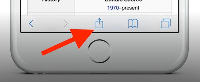
To add this web app to your homescreen, click on the "Share" icon
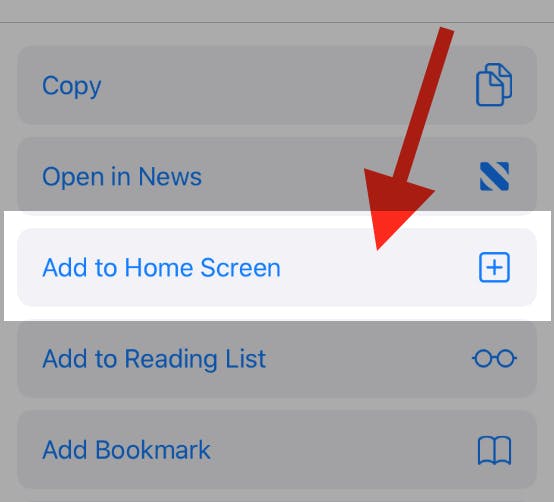
Then click on "Add to Home"
To add this web app to your homescreen, click on the "Share" icon
Then click on "Add to Home"
It looks like your browser doesn't natively support "Add To Homescreen", or you have disabled it (or maybe you have already added this web app to your applications?)
In any case, please check your browser options and information, thanks!
It looks like your browser doesn't natively support "Add To Homescreen", or you have disabled it (or maybe you have already added this web app to your applications?)
In any case, please check your browser options and information, thanks!
